What Are the Best Color Combinations for Living Room?
This site contains affiliate links. I may earn a small commission, at no extra cost to you.
Let’s find the best color combinations for your modern living room.
Okay, be honest—how many times have you stared at your living room wall thinking, “Why does this still look like a dentist’s waiting room?” 😬 Don’t worry, I’ve been there too. Picking the perfect color combo for a modern living room feels like solving a Rubik’s Cube blindfolded. But here’s the thing—it doesn’t have to be complicated. You don’t need an interior design degree or 67 paint swatches taped to your wall. You just need a little guidance, a splash of creativity, and maybe a tiny bit of trial and error (I’m looking at you, neon green accent wall I thought was a good idea in 2013).
So, if you’re wondering what are the best color combinations for a modern living room—you’re in the right place. I’ve tested, researched, and obsessed over this, so now you don’t have to. Let’s dive in (wait, scratch that—we promised no fluff). Let’s get into it. 😎
Why Color Combinations Matter in a Modern Living Room
Let’s get something straight: color sets the vibe. It’s the difference between “cozy Netflix haven” and “please never invite guests over again.”
Creates Visual Flow
Ever walked into a room and thought, “Wow, this feels… right”? That’s not an accident. A solid color combo creates flow, meaning every element—your couch, rug, artwork—feels like it belongs.
Defines Your Style
Minimalist? Industrial? Scandinavian? Farmhouse-modern hybrid that only exists on Pinterest boards? Your color palette tells people what kind of vibe you’re going for—without screaming it.
Impacts Mood
Colors affect how we feel. Soft neutrals soothe, deep blues calm, and bold reds… well, sometimes they just give off “emergency room” energy. 😅 So yeah, choosing wisely = living well.
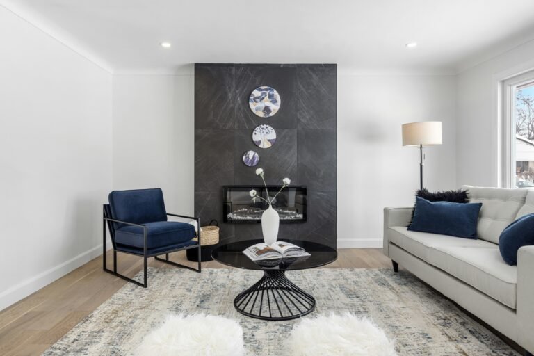
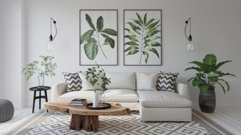
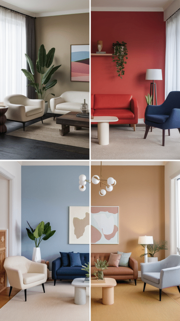
Classic + Clean: White and Charcoal Gray
Honestly, this combo is like the black blazer of living rooms—it never goes out of style.
Why It Works
- White keeps things bright and open, perfect if your living room is more “cozy nook” than “sprawling loft.”
- Charcoal adds depth and drama without feeling harsh like full-on black.
- It’s a minimalist’s dream but doesn’t feel sterile (unless you skip the throw pillows—please don’t skip the pillows).
Pro Tip:
Throw in natural wood tones or greenery to keep it from looking too monochrome. IMO, a touch of plant life goes a long way. 🙂
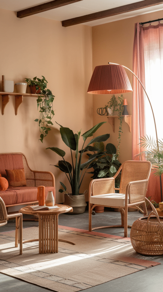
Warm and Welcoming: Beige and Terracotta
Terracotta is like the friend who shows up late but makes up for it by bringing snacks. Unexpected, but totally lovable.
Why It Works
- Beige is the new gray—it’s soft, earthy, and plays well with almost anything.
- Terracotta adds warmth, personality, and that lived-in feel modern spaces sometimes lack.
- This combo is perfect for anyone leaning toward boho or mid-century modern vibes.
How to Style It:
- Go for linen textures and wicker or cane furniture.
- Accent with burnt orange, olive green, or muted gold.
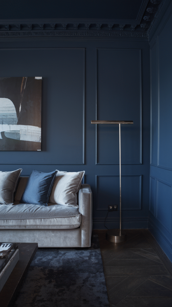
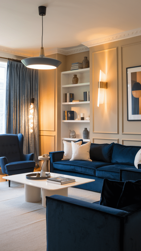
Cool and Collected: Navy and Soft Gray
Feeling fancy? This one’s for you.
Why It Works
- Navy brings richness and sophistication without overpowering the room.
- Soft gray balances it out, keeping things grounded and modern.
- It’s basically the lovechild of classic and contemporary.
Perfect For:
- Larger living rooms (dark colors can shrink small spaces—FYI).
- Spaces where you want a little drama without going full Broadway.
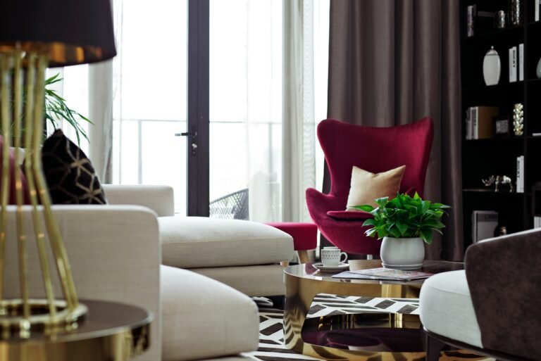
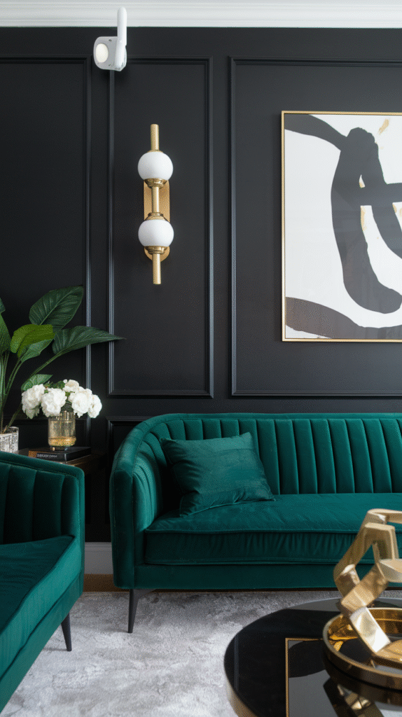
Bold and Modern: Black and Emerald Green
Okay, hear me out—this is not as risky as it sounds.
Why It Works
- Emerald green adds luxury and depth. It’s like velvet in color form.
- Black gives it structure and edge. Together? They’re unstoppable.
- Works best when paired with metallic accents—think gold lamps or brass cabinet pulls.
Not Ideal For:
- Super small spaces without natural light. Unless you want it to feel like a stylish cave. 😅
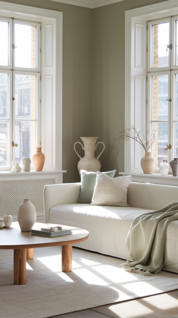
Airy and Fresh: Sage Green and Off-White
You know that vibe when you’ve just opened your windows on a sunny morning, and everything feels new? That’s this color combo.
Why It Works
- Sage green is soothing, trendy, and surprisingly versatile.
- Off-white keeps it crisp, so it doesn’t get too “grandma’s old sofa.”
- It feels clean, relaxed, and quietly stylish.
Style It With:
- Light woods, ceramics, and linen or cotton textiles.
- Pops of muted pink or soft gold if you want a little flair.
High Contrast: Cream and Navy Blue
Not quite ready to go full Scandi white-out? Try this.
Why It Works
- Cream feels warmer than white, which means cozy without going full brown-beige.
- Navy adds structure and drama, without overwhelming the space.
- This combo gives classic-meets-modern energy.
Bonus:
It looks great in both natural light and artificial light. Ever tried taking a selfie in a poorly lit brown room? Exactly.
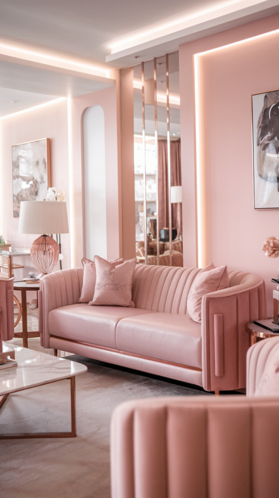
Playful and Chic: Blush Pink and Warm Gray
Look, pink isn’t just for nurseries anymore. Blush is grown-up now.
Why It Works
- Warm gray grounds the look, while blush keeps it fun.
- It’s great if you want something soft but not blah.
- Works wonders with brass, marble, or rose gold accents.
IMO:
This combo gives your living room a soft glam vibe without looking like Barbie lives there. 😅
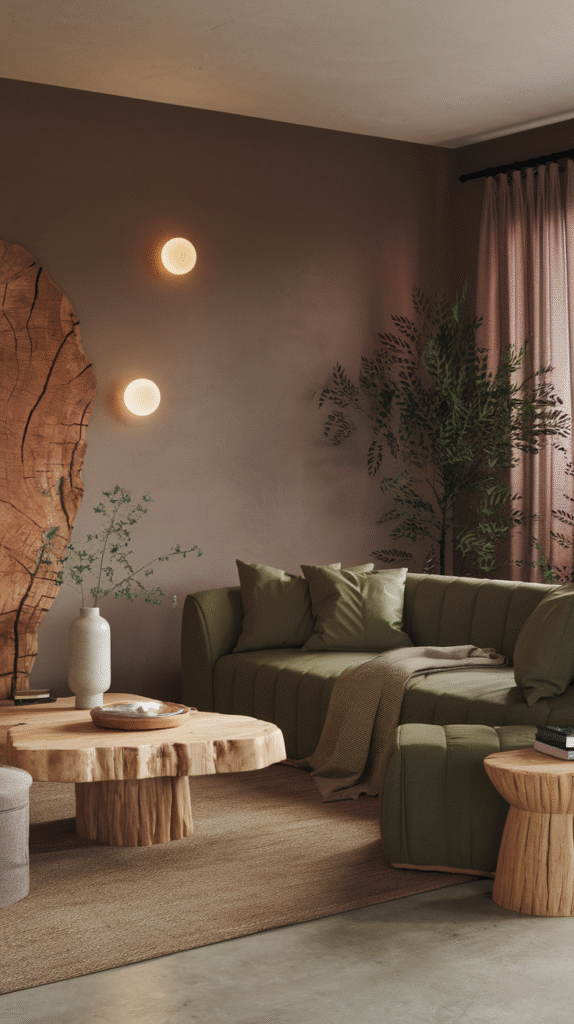
Earthy and Neutral: Taupe and Olive Green
You want modern, but you also want it to feel like a warm hug? Go earthy.
Why It Works
- Taupe is neutral with character. It’s not beige. It’s beige’s cooler cousin.
- Olive adds an organic, grounded feel that just feels “right.”
- Together, they make your space feel relaxed, curated, and natural.
Best For:
- Homes with wooden elements, lots of textiles, and nature-inspired decor.
- People who want “Pinterest-worthy” without trying too hard. 😉
How to Choose the Right Combo for Your Space
Okay, now that we’ve gone through all the dreamy combos, let’s be real. Not every palette works in every space. So how do you figure out which one’s right for you?
Consider Your Lighting
- North-facing rooms need warmer tones to counteract the cool light.
- South-facing rooms? You can go cooler without turning into an ice palace.
Think About the Mood You Want
- Want calm? Go neutrals and soft tones.
- Want energy? Try bold colors with contrast.
- Want luxury? Deep hues and metallic accents are your BFFs.
Look at What You Already Own
Before you decide to repaint your whole living room based on this article (though I’d be flattered), check what colors you’re already working with. Your sofa, rug, and art may already be telling you what palette to use.
Final Thoughts: Don’t Be Afraid to Mix It Up
Still wondering what are the best color combinations for a modern living room? Truth bomb: there isn’t just one right answer. There’s the right combo for you, and that’s what really matters.
Play around. Try samples. Stare at swatches for an unreasonable amount of time. And don’t forget—you can always change it. Paint isn’t forever, and pillows are cheap. Your space should make you feel happy, relaxed, and maybe even a little smug when your friends walk in and go, “Wow, this looks amazing.”
So grab that color wheel (or just open Pinterest), trust your gut, and make your living room the modern, stylish sanctuary it deserves to be. 💪
And hey, if your first try flops? Welcome to the club. That’s what paint rollers are for. 😉