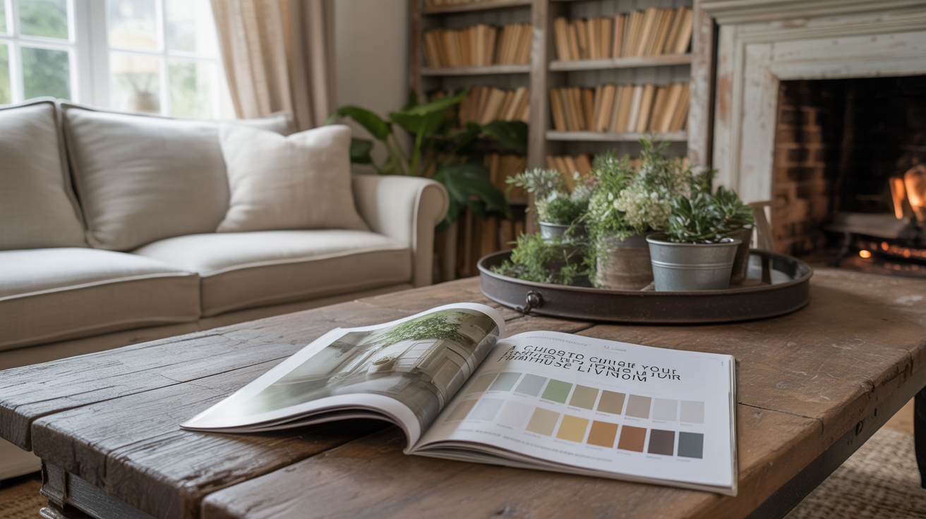
A Guide to Choosing Colors for Your Farmhouse Living Room
This site contains affiliate links. I may earn a small commission, at no extra cost to you.
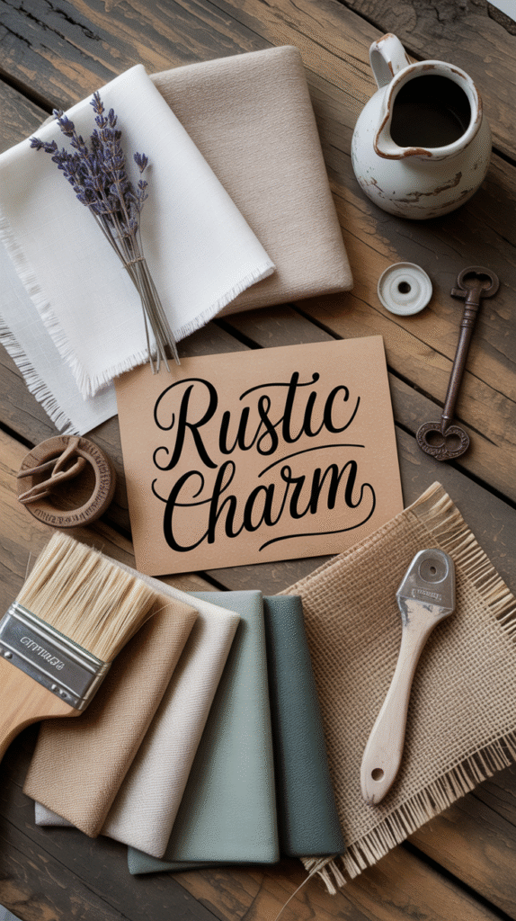
So, you’re staring at your living room walls like they just insulted your grandma, wondering what on earth to do with them. You want that cozy, rustic charm—you know, the kind of vibe that says “I bake sourdough for fun” without actually needing to learn how to bake sourdough. If you’ve ever felt personally attacked by the phrase “just choose a neutral,” this one’s for you. Let’s talk farmhouse living room colors—the ones that actually work, the ones that don’t, and everything in between. Spoiler: not everything has to be white. 😏
I’ve spent way too many hours obsessing over paint swatches, scrolling Pinterest at 2 AM (we’ve all been there), and regretting a few “greige” decisions. So I’ve got your back—no fluff, no filler, just real tips with a side of sass.
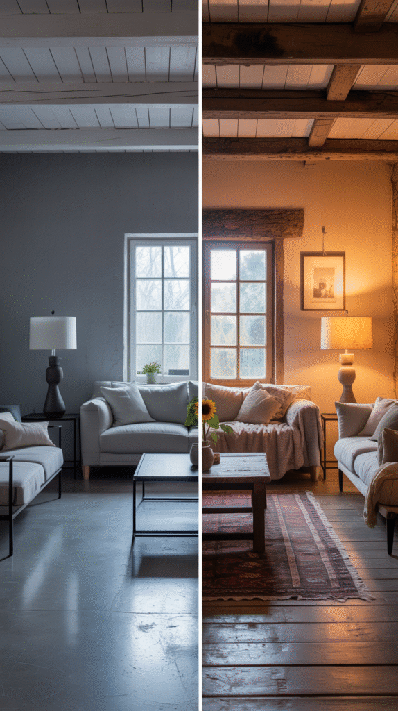
Why Color Matters in a Farmhouse Living Room
Let’s be real—farmhouse style isn’t just about shiplap and mason jars (though we love those too). It’s about warmth, simplicity, and a down-to-earth vibe. And guess what sets that tone before a single throw pillow enters the scene? Yup—the colors you pick.
The right farmhouse living room colors can:
- Make your space feel warm and inviting, like a hug in paint form.
- Highlight natural textures like wood beams or stone fireplaces.
- Create that laid-back, effortless style we’re all trying so hard to make look effortless.
Pick the wrong ones, though, and your “charming” farmhouse becomes a sterile dentist’s office. Yikes.
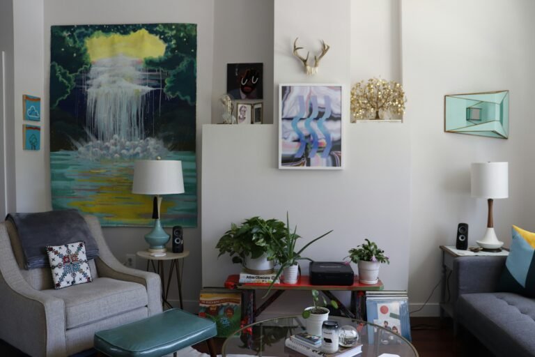
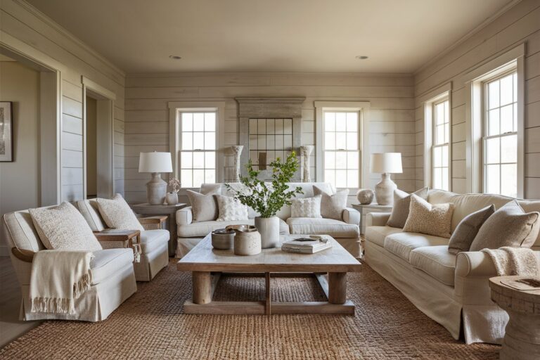
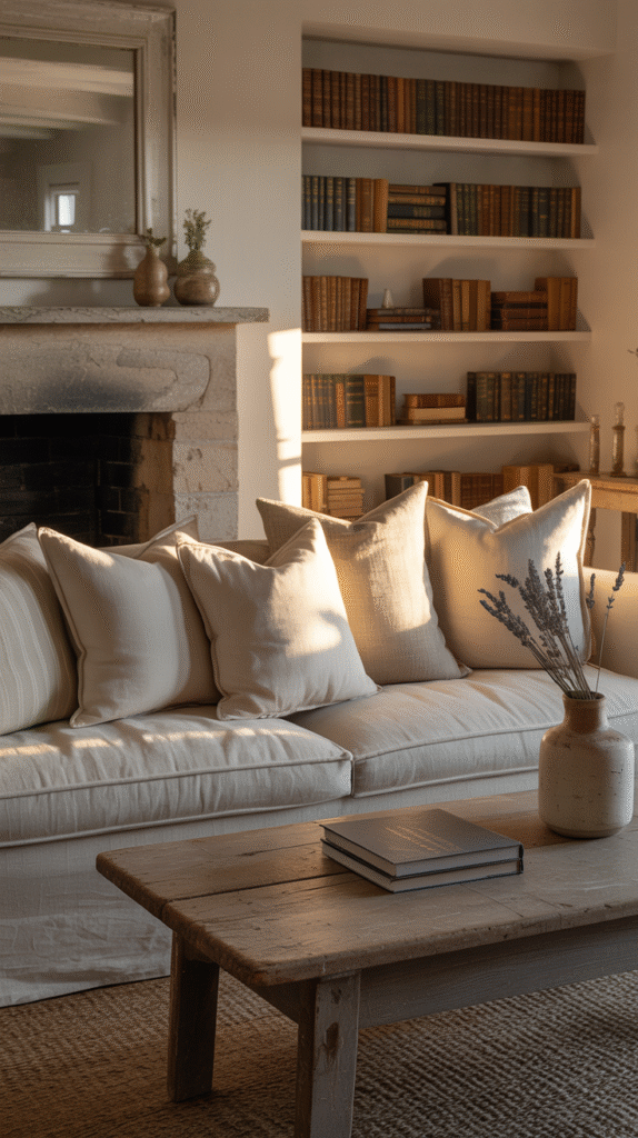
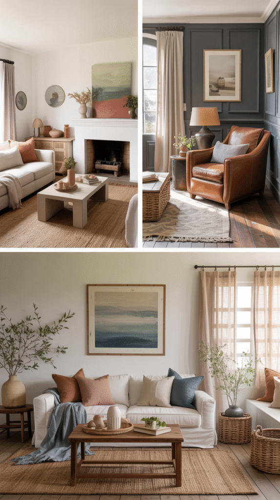
The Classic Neutrals (That Aren’t Boring, I Promise)
White—but Make It Cozy
I know, I know. White walls can feel like a cop-out. But the right white? It’s farmhouse gold.
Look for warm-toned whites like:
- Benjamin Moore White Dove
- Sherwin Williams Alabaster
- Behr Swiss Coffee
These guys have a soft, creamy vibe that pairs perfectly with rustic wood furniture. None of that blinding, hospital-room nonsense. Ever tried sipping coffee in a cold, blue-toned white room? Instant mood killer.
Greige Is the Real MVP
Greige (gray + beige) is the Beyoncé of farmhouse living room colors. It goes with literally everything and gives just enough contrast without stealing the show.
Top picks:
- Sherwin Williams Agreeable Gray
- Benjamin Moore Revere Pewter
You get that grounded, earthy feel—without looking like you’re trying too hard. Because who wants their walls shouting for attention anyway?
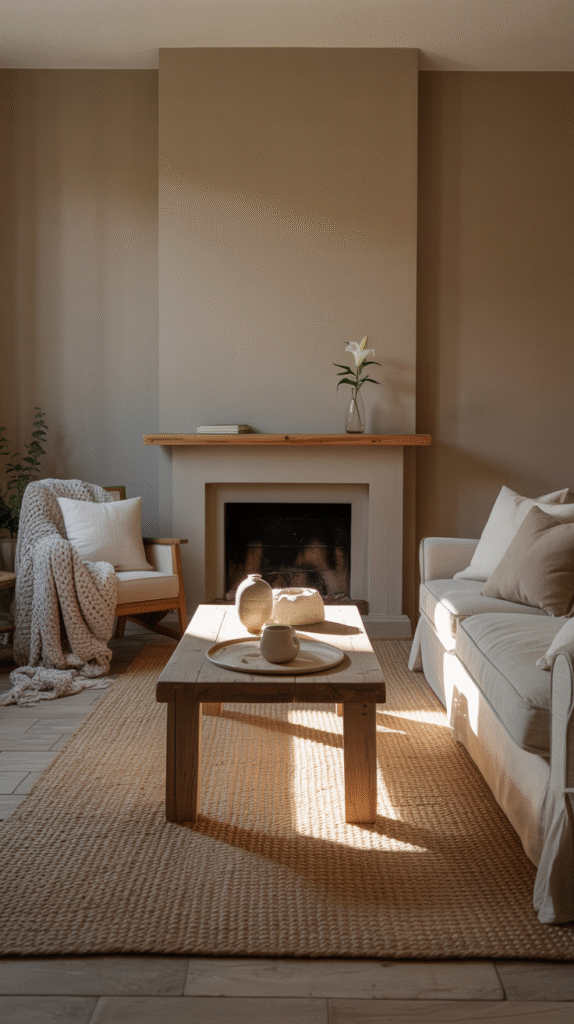
Earthy Tones That Bring the Outside In
Let’s talk real farmhouse energy: earthy, grounded colors that make you want to curl up with a blanket and pretend you live in the countryside even if your “farm” is a Target candle and a houseplant you keep forgetting to water. (Guilty.)
Sage Green Is Basically Therapy
I could write love letters to sage green. It’s calming, soft, and feels like a deep breath. If you’re not using sage green in your farmhouse palette, what are you doing?
Pair it with:
- Natural wood tones
- Linen curtains
- Black iron accents
It’s modern rustic magic.

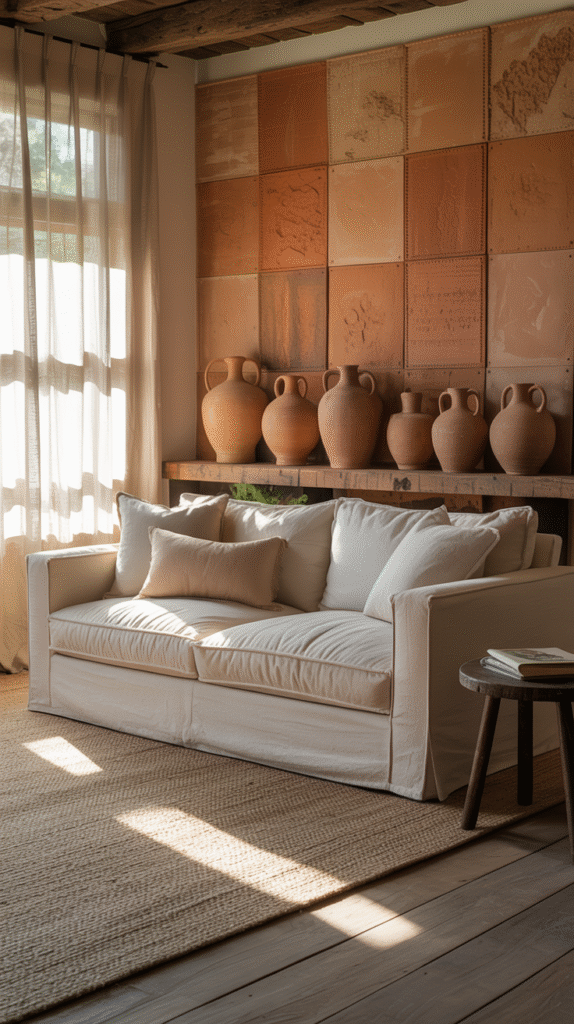
Terracotta & Clay—Trust Me
Warm, muted clay tones are having a major moment, and they absolutely belong in farmhouse living rooms.
Think:
- Sherwin Williams Cavern Clay
- Accent walls, pottery, or even just some throw pillows
They play so well with neutrals and add just enough spice without being full-on “Southwestern ranch redo.” 😉
Moody Colors—Yes, You Can Go Dark
Here’s a secret: you don’t have to keep everything light and airy for it to feel farmhouse-y. Bold, deep hues can work so well—especially when you balance them with lighter textures.
Navy Blue for the Win
Navy + farmhouse = total power couple. It gives that polished, traditional feel while still being cozy.
Use it for:
- A feature wall behind the sofa
- Built-in shelves
- Cabinets or paneling
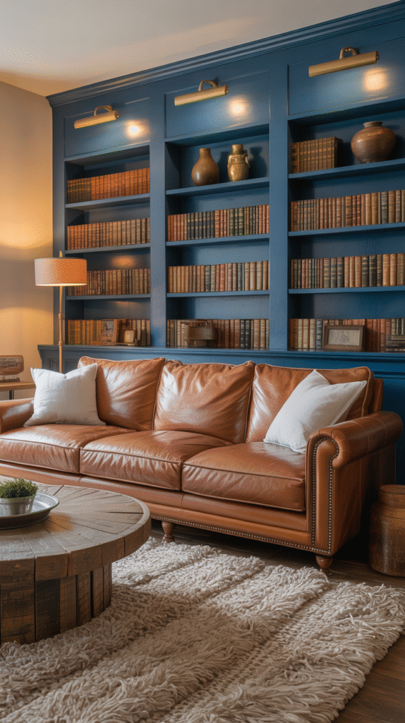
Pro tip: Pair it with brass or matte black hardware for that chef’s kiss vibe.
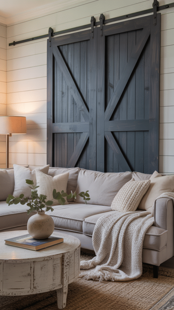
Charcoal Gray—But Make It Soft
If black feels a little aggressive, charcoal gray is your go-to. It adds depth and drama without sucking the life out of the room.
Try:
- Fireplace surrounds
- Barn doors (because yes, we’re still doing those)
- Upholstered furniture
FYI: Dark colors need good lighting to not look like a cave. Unless you’re going for vampire chic—no judgment.
Pops of Color (Yes, Farmhouse Can Be Fun)
I know farmhouse tends to live in the land of neutrals, but adding color doesn’t mean you’re breaking the rules. It just means you’re not afraid of a little fun.
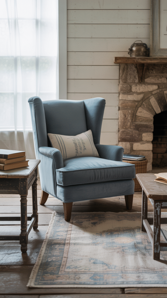
Dusty Blue—It’s Giving “Vintage Wash Day”
Okay, weird analogy, but hear me out. Dusty blue has that soft, faded feel that pairs perfectly with distressed wood and white shiplap. Think denim but classier.
Great for:
- Accent chairs
- Area rugs
- Painted side tables
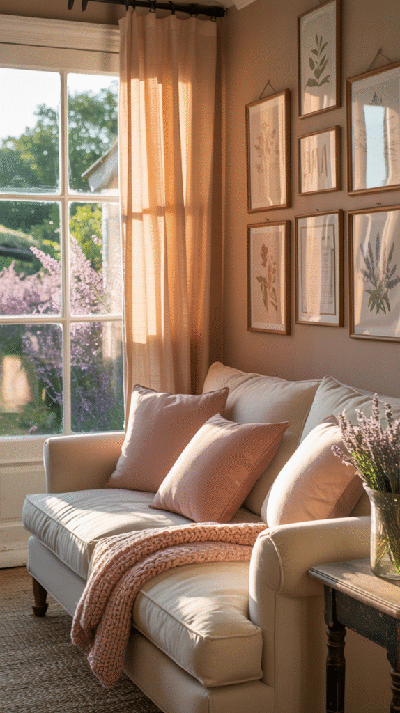
Blush & Soft Peach—Subtle but Chic
Want a bit of sweetness without turning your living room into a rom-com set? Enter blush tones. They warm up the space without being too much.
Try:
- Throw pillows
- Curtains
- Art prints
Just skip anything too shiny or bright—farmhouse is rustic, not rave-ready.
What NOT to Do (AKA the Color Crimes)
Let’s spare each other some regret, shall we? Here’s what I’ve learned the hard way:
Don’t Go Full-On Cool Gray
Unless you want your living room to feel like a dentist’s waiting room circa 2010, avoid icy grays. They clash with farmhouse textures and suck the warmth out of the room. Not cute.
Skip Neon or Ultra-Bright Anything
This isn’t a 90s Nickelodeon reboot. Farmhouse living room colors should feel muted, aged, and a bit soft around the edges. Think “lived in,” not “laser tag.”
Tips for Putting It All Together
Okay, you’ve picked your paint colors. Now what?
Create a Cohesive Palette
Choose 3–5 core colors max. A good mix might look like:
- One main wall color (like warm white or greige)
- One or two accent colors (sage green, navy, dusty blue)
- A couple supporting tones in decor (terracotta, blush, charcoal)
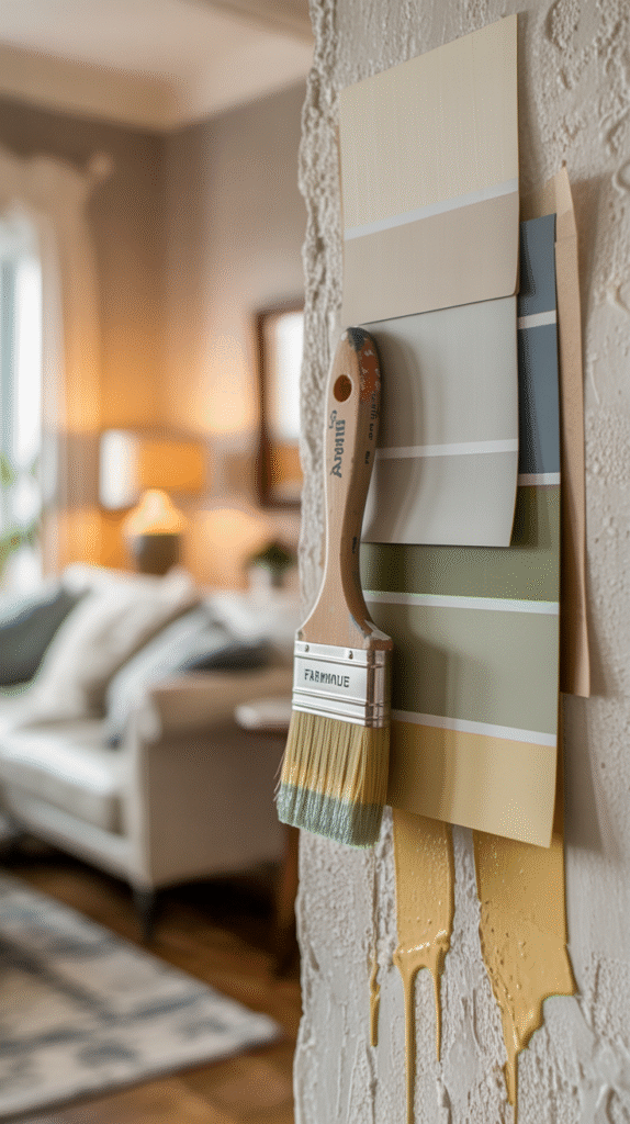
Use Samples Like Your Sanity Depends on It
Seriously—swatch everything. Paint that sample directly on the wall (not just on paper), and look at it during different times of day. Sunlight is a tricky little liar.
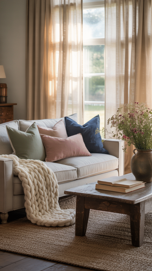
Tie It Together with Textiles
Here’s where you bring the palette to life:
- Pillows and throws in your accent colors
- Rugs that pull all your tones together
- Art and accessories that echo the palette without matching too perfectly (we’re not building a hotel lobby here)
Farmhouse Color Combos That Just Work (Steal These)
If you’re stuck, just copy one of these and tweak as needed:
Combo 1:
- Walls: White Dove
- Accents: Sage green, terracotta
- Wood: Natural oak
Combo 2:
- Walls: Revere Pewter
- Accents: Navy, blush
- Furniture: Warm leather + black iron
Combo 3:
- Walls: Alabaster
- Accents: Dusty blue, clay
- Decor: Jute, linen, soft grays
Final Thoughts: Don’t Overthink It (Seriously)
Look, your farmhouse living room colors don’t need to follow a rulebook. If it makes you feel good, it’s probably the right choice. Farmhouse style is all about authenticity, comfort, and things that stand the test of time. Not trends, not Pinterest pressure, and definitely not what your cousin Sharon swears is “in right now.”
So test some paint, trust your gut, and maybe don’t paint everything white just because everyone else is doing it. Unless you love white—in which case, go nuts. 😉
And hey, your living room doesn’t have to look like Joanna Gaines personally decorated it to be amazing. It just has to feel like home.
Ready to tackle those walls? Grab a brush, pop on a podcast, and let your inner farmhouse genius loose. You got this. 💪