How to Choose the Right Home Office Colors
This site contains affiliate links. I may earn a small commission, at no extra cost to you.
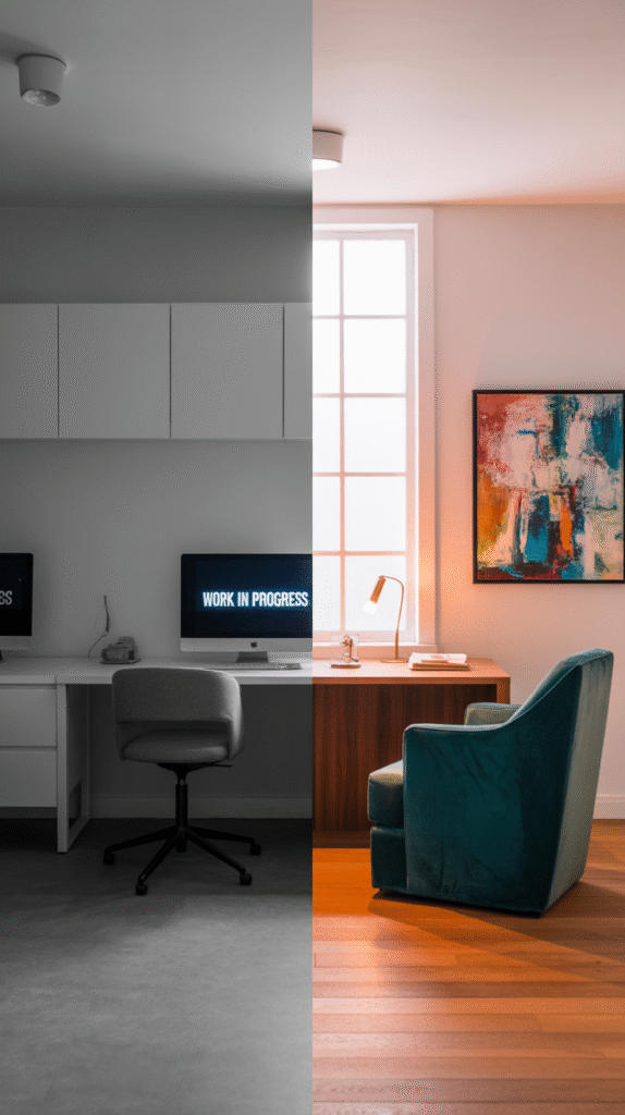
So you’ve decided it’s time to finally give your home office a glow-up. Maybe you’re sick of staring at blank white walls that scream “IKEA showroom” or maybe you’re just tired of feeling uninspired while replying to emails in a space that has the energy of a dentist’s waiting room.
Whatever your reason—you’re here because you want to nail your home office decor colors, and you want to do it right. Trust me, I’ve been there. I once painted my office a trendy dark green thinking it would feel moody and cool… spoiler: it felt like working inside a cave 😬.
Let’s fix that, shall we?
Why Home Office Decor Colors Actually Matter
Okay, I know what you’re thinking: “It’s just a wall color, how big of a deal can it be?” Huge. Gigantic. Monumental.
The colors you use in your home office directly affect your productivity, mood, and energy. Think about it—would you rather brainstorm your next genius idea in a bright, airy space or one that feels like the inside of a cardboard box?
Colors aren’t just for aesthetics—they shape your entire vibe. Here’s what I’ve noticed from both experience and way too many Pinterest boards:
- Warm tones (like terracotta or golden beige) = cozy and inviting
- Cool tones (like blue or sage green) = calm and focused
- Neutrals (white, gray, soft taupe) = clean and minimal (unless overdone, then it’s just boring)
- Bold tones (navy, forest green, even black) = stylish but risky. You gotta balance them out
Ever sat in a bright yellow room and felt oddly jittery? Exactly.
Start With How You Want the Room to Feel
Before you grab a paintbrush or click “Add to Cart” on that trendy wallpaper, ask yourself this: What do you want your home office to feel like?
Is it a space for creative chaos or laser-sharp focus? Do you need energy or calm?
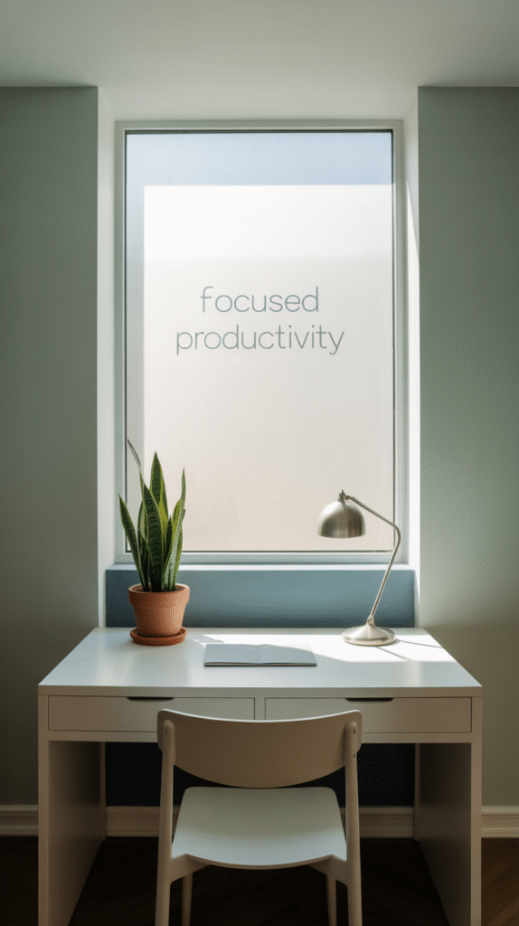
Need a Productivity Boost?
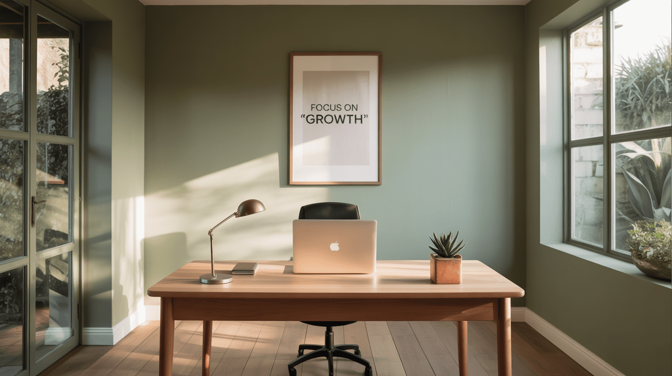
Go for cooler shades like soft blue, muted green, or even a touch of lavender.
These tones can:
- Reduce stress
- Help you concentrate
- Keep your brain from melting by 3 PM
I once painted my wall a chalky blue, and no joke, I stopped doom-scrolling for at least two weeks. Coincidence? Maybe. But probably not.
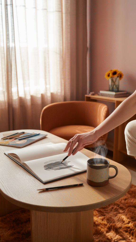
Want to Feel Inspired and Creative?
Try warmer tones or earthy neutrals. Think blush pink, burnt orange, clay, or even ochre.
These shades:
- Spark creativity
- Feel welcoming and energizing
- Make the space feel “lived in” (in a good way—not like your teenager’s bedroom)
FYI: Don’t go full fire engine red unless you want your office to feel like an emergency room. Been there. Regret it.
Match Your Color to the Natural Light (Seriously, It Matters)
You’d think color is just color, but lighting changes everything. The same beige can look buttery in the morning and muddy by afternoon.
North-facing rooms
Tend to be cooler and get less natural light. You’ll want warmer tones to balance that out. Think creamy whites, warm greys, or pale peach.
South-facing rooms
These are the golden children. They get tons of warm natural light, so you can get away with cooler or darker tones without making the space feel like a dungeon.
East-facing rooms
Morning people, rejoice! These rooms glow in the morning, so soft, fresh colors work great here. Pastels, baby!
West-facing rooms
The light gets more intense as the day goes on, so muted neutrals or cooler tones help keep things balanced when the sun blasts through your blinds at 4 PM.
Moral of the story? Don’t pick your paint at night under your kitchen lightbulb. Just… don’t.
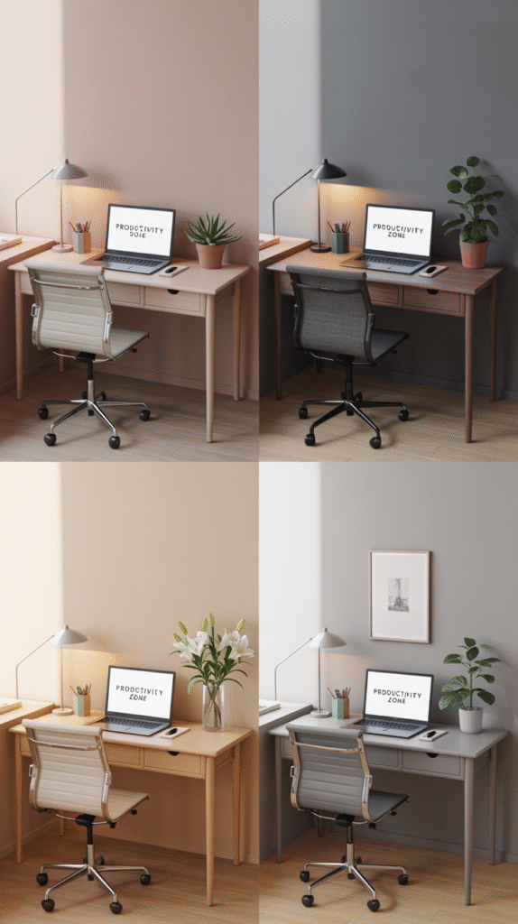
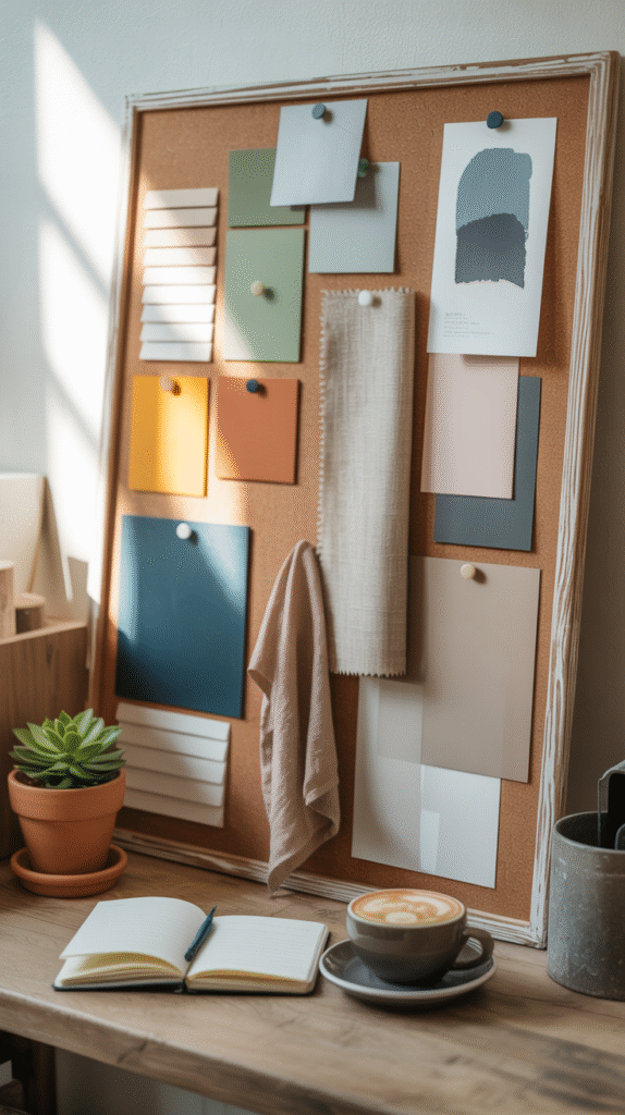
Pairing Colors Without Making It Weird
Choosing a single paint color is one thing, but creating a whole color scheme? That’s next-level. And also, weirdly fun.
Here’s how to build a color palette that looks intentional (not like you closed your eyes and picked three random swatches):
The 60-30-10 Rule
This one’s a lifesaver. Use:
- 60% for your main color (walls, maybe a big rug)
- 30% for secondary color (desk, shelves, accent chair)
- 10% for the pop of color (plants, art, throw pillows, you get it)
Use Neutrals as Anchors
If you’re scared of color (hi, fellow commitment-phobe), start with a neutral base and layer in the fun stuff. A soft gray with accents of sage and brass? Chef’s kiss.
Stick to 3-4 Colors, Max
Any more than that, and it starts looking like a pack of Skittles exploded. IMO, unless you’re a pro designer or very brave, less is more.
Accent Walls: Still a Thing?
Short answer: Yes. But make it cute.
Long answer: Accent walls are great when you want a punch of personality without drowning the room in color. Just make sure:
- You pick the wall that makes sense (behind your desk is usually a safe bet)
- You balance it with neutral or lighter elements
- You don’t go overboard with pattern unless your goal is mild visual chaos
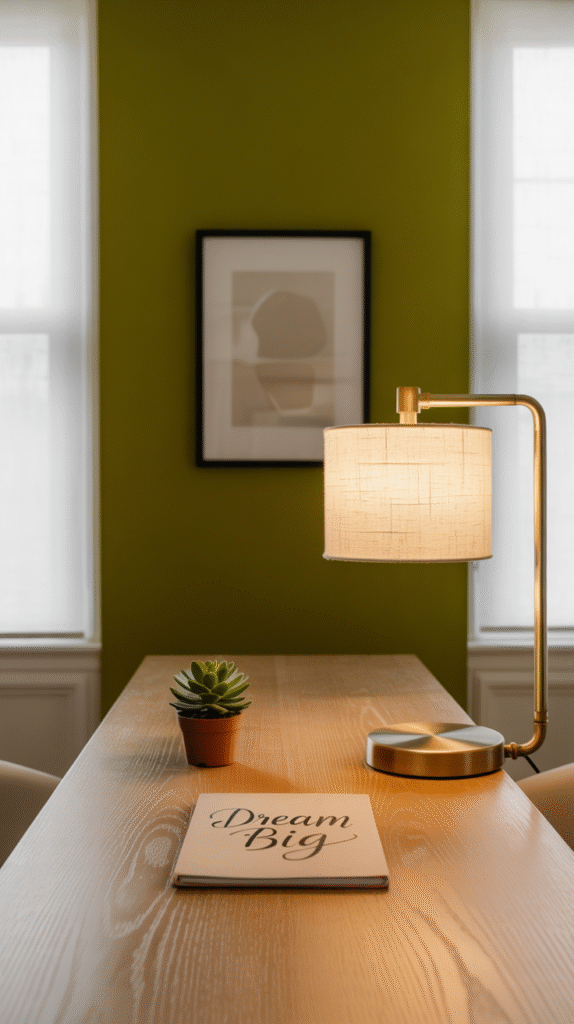
I painted my accent wall a moody olive once, paired it with brass hardware and a cream desk, and suddenly my boring little corner looked straight out of a home office Pinterest board.
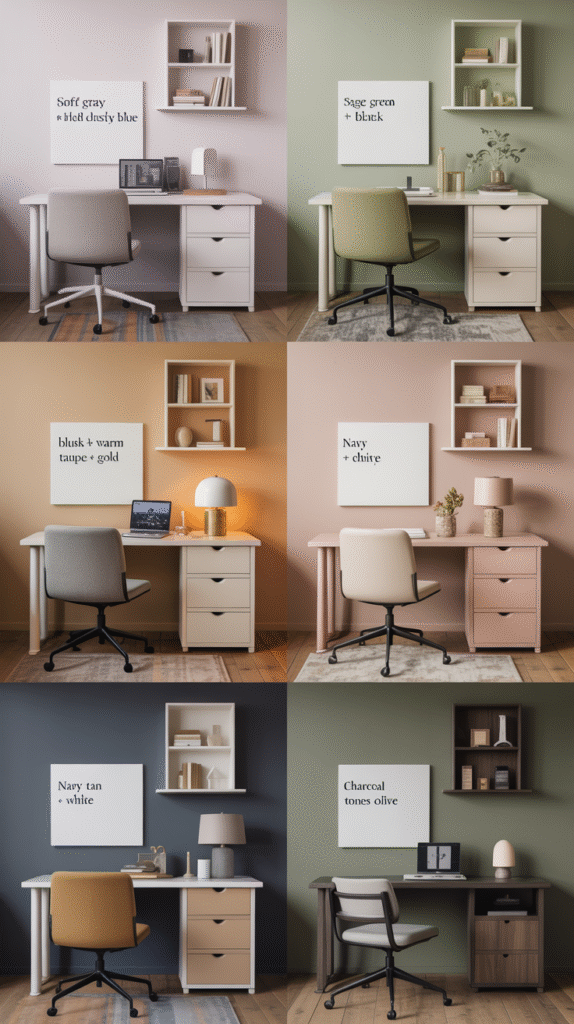
Popular Color Combos That Actually Work
Need some inspo? Here are a few no-fail home office decor color combos that I’ve tried (and loved):
- Soft Gray + White + Dusty Blue: Classic, clean, and calming.
- Sage Green + Cream + Black Accents: Modern and earthy, like you own a plant shop.
- Blush + Warm Taupe + Gold: Feminine, cozy, and chic.
- Navy + Tan + White: Timeless and surprisingly not-too-dark.
- Charcoal + Wood Tones + Olive: Sophisticated and grounded.
💡 Pro tip: If it looks good on your favorite sweater or in a coffee shop you love, it’ll probably look good in your office too.
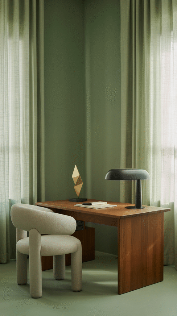
Don’t Forget About Texture and Finish
Color isn’t just about, well, color. Finish and texture play a huge role.
- Matte finishes feel cozy and soft but are harder to clean (goodbye, coffee splashes).
- Satin or eggshell is the sweet spot: subtle sheen, easy to wipe.
- Glossy paint? Not unless you’re painting a 1950s diner. 😅
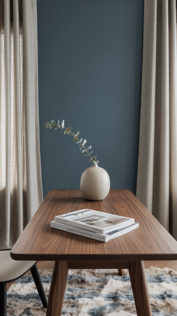
Also, layer in different textures—wood, metal, textiles—to make your color scheme feel richer and more intentional. A matte navy wall paired with a walnut desk and linen curtains? Perfection.
What About the Furniture and Decor?
Ah yes, the supporting cast.
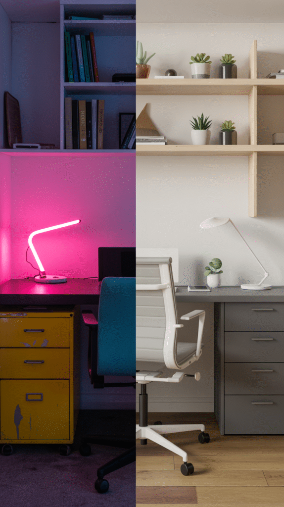
Once you lock down your home office decor colors, don’t sabotage the whole vibe with clashing furniture. IMO, this is where most people mess up. (Yep, I’m calling you out, rolling neon desk chair.)
Stick with pieces that:
- Compliment your color palette
- Feel cohesive but not matchy-matchy
- Add contrast in a good way (like a black lamp on a pale pink desk)
And for the love of aesthetics, get rid of that 2006 plastic filing cabinet. 😐
Trust Your Gut (and Your Eyes)
This might sound cliché, but if you walk into your home office and it makes you smile, you picked the right colors. Period.
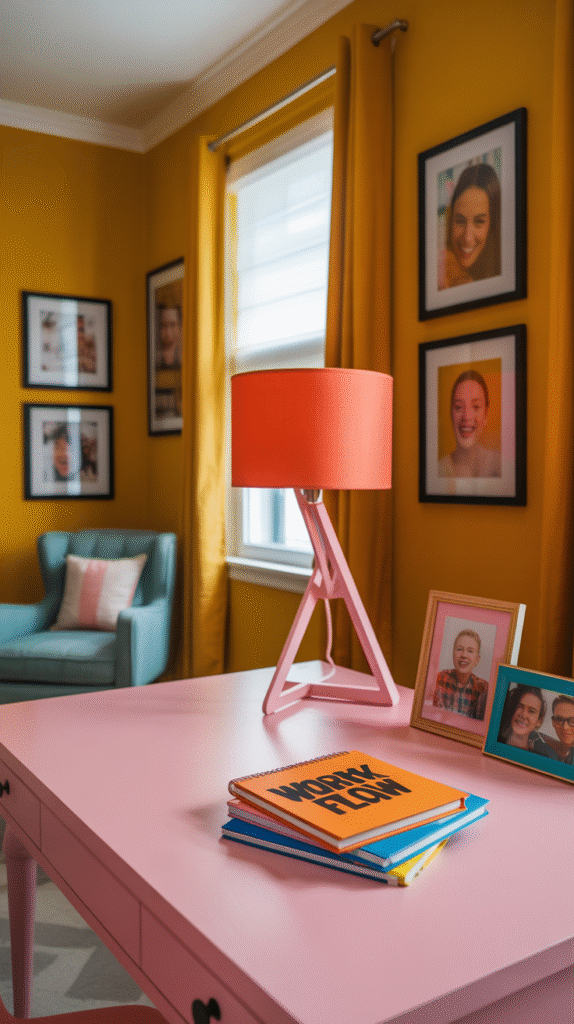
Paint chips, inspo boards, and TikTok trends can only take you so far. At the end of the day, you’re the one who has to work in this space. So if you love it, it works. Even if that means your walls are mustard yellow and your desk is bubblegum pink. (Bold choice, but hey—you do you.)
Final Thoughts: Go With Your Vibe, Not Just the Trend
Let’s be real: you don’t need another sterile beige room in your house. Your home office should reflect YOU—your energy, your style, your weird obsession with terracotta everything.
So take your time, test out swatches, hold them up in natural light, and trust your instincts.
Oh—and if you make a mistake? Paint is literally the easiest thing to change. Worst case, you repaint. Best case? You create a workspace that makes you feel like an absolute boss. 🎨💪
Now go forth and conquer those color samples. Your dream home office is just a paint can away.