What Is the Best Colour Combination for Modern Kitchens?
This site contains affiliate links. I may earn a small commission, at no extra cost to you.
Alright, let’s get real for a second—choosing the perfect colour combination for your modern kitchens can feel like picking your favorite Netflix show. So many options, all promising to “change your life,” and yet… you still end up staring blankly at paint samples wondering if Greige is a typo or a lifestyle.
FYI, I’ve been there. Stuck between wanting that sleek, modern look and not wanting my kitchen to look like a sterile hospital corridor. So if you’re in that boat—wondering what are the best colour combinations for modern kitchens—this little chat is for you.
Before we move forward, a few of my favorite products to give an instant modern touch to your kitchen.


Let’s break it down like we’re two friends chatting over coffee (or wine—I don’t judge). 🍷
Why Kitchen Colours Actually Matter (Like, A Lot)
Let’s start with the obvious: your kitchen is the heart of your home. It’s where you sneak midnight snacks, host chaotic family brunches, and pretend to be on MasterChef while burning toast. So yeah, the colours you choose? They matter.
Ever walk into a kitchen and feel instantly cozy or, on the flip side, like you’re about to be interrogated? That’s the power of colour psychology, baby. The right combo can make your space feel brighter, cleaner, bigger—even more expensive.
And let’s be honest, if we’re dropping cash on renovations, we might as well get a little “wow” out of it, right?
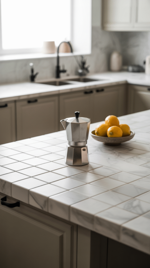
Classic with a Twist: White & Wood
Yep, white kitchens aren’t going anywhere, but here’s the trick—pair them with warm wood tones to keep things from feeling too… dental office.
Why It Works:
- White reflects light, making your kitchen look bigger and more open.
- Wood tones (think oak, walnut, or ash) add warmth and texture.
- It’s a timeless combo—aka it won’t look outdated in six months.
Pro Tip:
Go for matte white cabinets with natural wood floating shelves. Throw in some black hardware and voilà—instant Instagram kitchen.
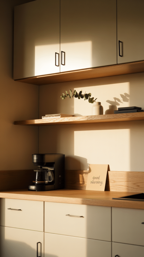


IMO, this combo is a total no-brainer if you want that clean, Scandinavian vibe without sacrificing warmth.
Dramatic & Modern: Charcoal and Gold
Want your kitchen to scream chic adult who knows what a wine aerator is? Enter the charcoal and gold dream team.
Why It Works:
- Charcoal (aka deep grey) brings in drama and elegance without being as stark as black.
- Gold accents—faucets, handles, even pendant lights—add a splash of glam.
Just Don’t:
Go overboard with the gold. You’re designing a kitchen, not a royal palace. 🙃
Pair charcoal cabinets with white countertops and brushed gold hardware to keep things balanced and boujee.


Soft and Sophisticated: Sage Green and Cream
You know that feeling when you walk into a spa and suddenly remember how to breathe? That’s what sage green and cream can do for your kitchen.
Why It Works:
- Sage green is calm, grounding, and pairs beautifully with natural materials.
- Cream softens the palette without being boring like plain white.
Vibe Check:
This combo works wonders in homes that lean boho, cottagecore, or coastal chic. Add brass fixtures and stone countertops to make it sing.
Pro move? Paint your lower cabinets sage and keep the uppers cream. You’ll thank me later.


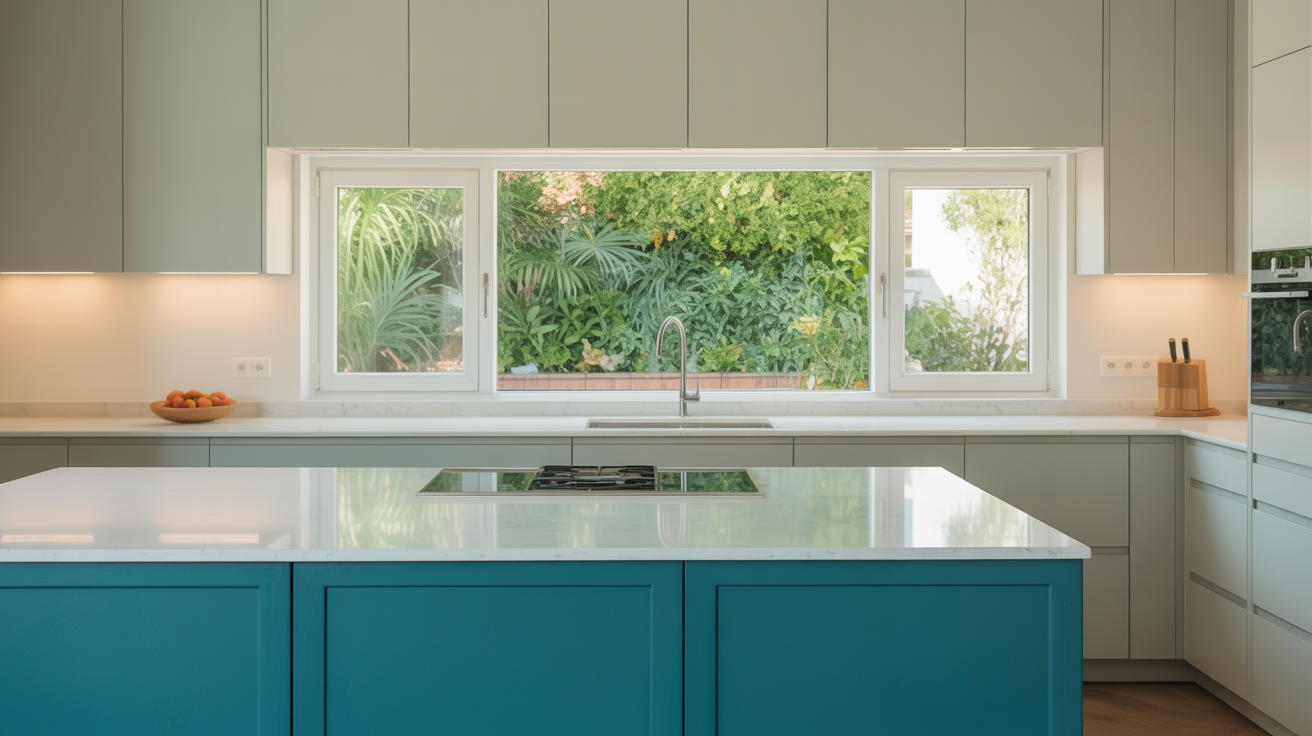
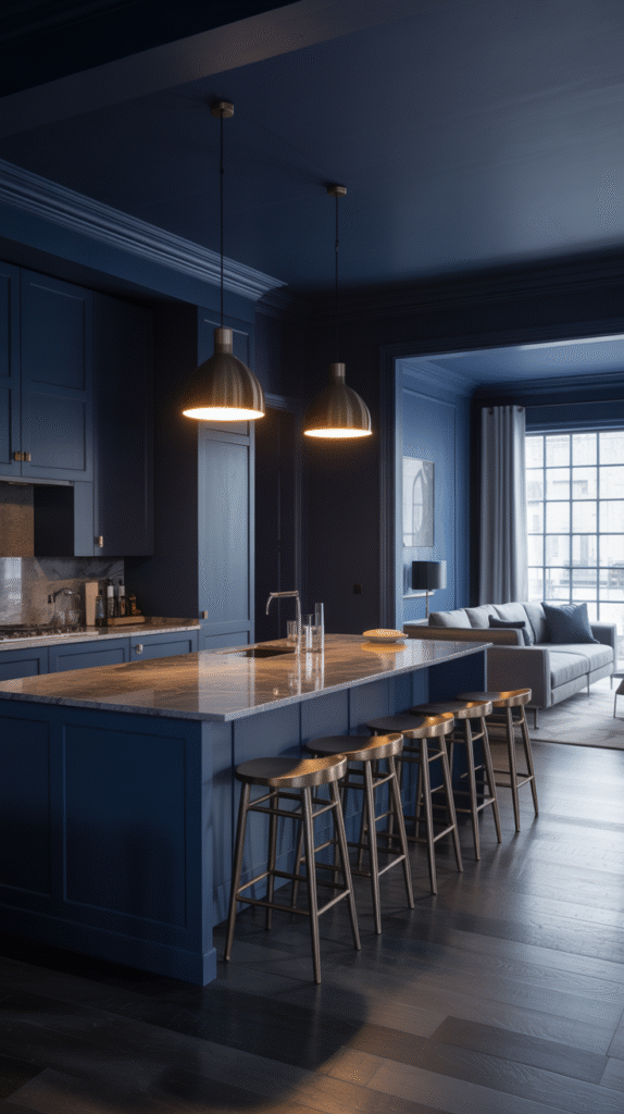
Bold and Moody: Navy and Brass
Okay, I’m not saying this combo will turn your kitchen into a movie set—but I’m also not not saying that. 😏
Why It Works:
- Navy is bold without being aggressive.
- Brass fixtures add just enough shine without looking tacky.
- Together? They look ridiculously luxe.
Where to Use It:
This combo is killer for open-plan kitchens or spaces that need a little punch. Go all in with navy cabinets, or if you’re scared of commitment, try a navy island with brass pendant lights.
And yes, you can mix in white marble countertops to keep things fresh and not too dark.


Light and Airy: Pale Blue and White
Looking for something fresh but not boring? Say hello to pale blue and white—the colour combo equivalent of a deep breath on a spring morning.
Why It Works:
- Pale blue feels clean, crisp, and optimistic.
- White balances it out, keeping things light and open.
Best For:
Smaller kitchens or anyone who doesn’t want a trendy look that’ll feel dated in a year.
Add in chrome or matte black fixtures, and maybe a butcher block countertop, and you’ve got something stylish and inviting.


Understated Cool: Greige and Black
Greige = grey + beige. And yeah, I used to think it was made up, too. But it turns out, it’s kind of magical.
Why It Works:
- Greige is warm, neutral, and super versatile.
- Black accents give it a little edge and modern flair.
Try This:
Paint your cabinets greige and use black handles, faucet, and lighting. Add a little texture with white or marble countertops, and you’ve got that laid-back, designer feel.
This one’s for people who say things like “I want it to feel calm but cool”—you know who you are. 😉
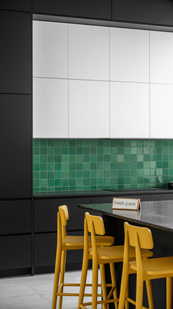
Colour Pop Moment: Black, White, and a Splash of Something Wild
Okay, hear me out. What if you keep your base black and white—super classic—and then throw in a wildcard colour like emerald, mustard, or coral?
Why It Works:
- Black and white = timeless foundation.
- A bold pop keeps things playful and unexpected.
- You can change the pop colour with accessories if you’re non-committal (hey, no judgment).
Examples:
- White cabinets, black island, emerald green backsplash.
- Black and white tiles with mustard bar stools.
This one’s for you if you want something fun and fearless without turning your kitchen into a Crayola box.
Do’s and Don’ts of Mixing Kitchen Colours
Before you grab a paintbrush and start slapping colours on everything, let’s cover a few quick do’s and don’ts to save you some future regret:
✅ Do:
- Test swatches in your actual lighting—what looks “soft sage” at the store might look “mint toothpaste” at home.
- Stick to 2–3 main colours. Keep it cohesive, not chaotic.
- Balance bold and neutral tones—this helps anchor the space.
❌ Don’t:
- Mix too many textures or finishes—brushed gold + chrome + rose gold = chaos.
- Ignore the vibe of your home. A neon orange kitchen in a traditional colonial? Yikes.
- Go trendy just to be trendy. You have to live with it every day, not the Pinterest algorithm.

Final Thoughts: Pick What Feels Right for You
Look, I know we just covered a ton of gorgeous colour combinations, but at the end of the day? Your kitchen has to feel like you. If you love minimalist tones with a hint of drama, go for greige and black. Want to feel like you’re cooking on a Mediterranean coast? Sage and cream all the way.
Don’t get sucked into trends that don’t vibe with your actual lifestyle. (Unless your lifestyle is being extremely online, in which case, welcome to the club. 😎)
And remember: paint is not a tattoo. You can always change it later. So try, test, have fun—and don’t be afraid to get a little bold.
P.S. Still not sure? Grab a few paint samples, splash them on cardboard, and lean them against your cabinets for a few days. Your gut will tell you what’s working. And if it doesn’t, DM a friend with good taste and bribe them with snacks.
Now go forth and colour that kitchen like the stylish boss you are. 🎨🔥